

Aurify by Spotify
Aurify is a unique speaker that not only plays great music but also visually represents your music tastes through Spotify's generative artwork. Each speaker is distinctive, allowing others to recognize your music preferences and overall vibe. It's a way to share your identity through sound, visuals and connect via same.

Music is one of the pivotal part of our lives. Many of us even witnessing the dawn with their favourite tunes to rhythm their breaths and steps.
Infact people often pick partners based on shared music tastes, which reflect who we are. That's why we love sharing our annual spotify music recaps on social media and even select partners on their music taste ( *wink* *wink* dating apps )
LITERATURE STUDY
As the world’s largest audio streaming subscription service, Spotify has a unique opportunity to connect underrepresented artists and creators to more fans around the world.
They continue to use our platform to empower and celebrate creators of every race, ethnicity, religion, sexual identity, and gender, including by curating top audio destinations featuring Black, LGBTQIA+, women, Asian Americans and Pacific Islanders, and other underrepresented voices.
Demographics
We began the project by conducting research to better understand and acquire insight into the users complaints and wants. For more information, we summarised key themes from a collection of data and statistics linked to the research goals/topic:

Usage Statistics


Business Analysis

Ethnographic Study
Spotify is preferable above other services for a variety of reasons, including:


Direct Research
A questionnaire was issued to a group of 20 participants ranging in age from 18 to 34 years old. The mentioned are some of the responses that elicited the most perceptive insights..


User Persona
Armaan Koshal, 23 - College Student
“ I listen to music every day; I enjoy discovering and sharing new music with my pals. I believe that music is enjoyed the best when it's shared with others ”

Armaan is a university student who spends much of his time listening to music or listening to podcasts while doing household related chore duties. Audio is an escape and a way to learn new things for him.
He is required to bring his Bluetooth speaker to rehearsal being the member of dance society. He also prefers to study while listening to soothing music, thus he recently purchased a Bluetooth speaker after a recommendation from a friend.
Target User

Business Model
Spotify has revolutionised how people listen to and appreciate music. This was accomplished by switching from a "transactionbased" approach of purchasing and owning audio content to a "accessbased" model that allows customers to stream on demand. They're already fast moving into the next phase of their development to become the world's first genuine audio network.


The whole business model doesn’t contain any analogous product through which spotify gets it’s revenue from.
Spotify released one of it’s first analogous product called as ‘ Car Thing ‘ aimed at car drivers and integrating the Spotify experience with the car infotainment

Unfortunately due to bad market study and environment study for car users, the car thing faced sheer competition from already existing 'Android Auto' and 'CarPlay'. The product was big of an investment for it's target audience and delivered less compared to already existing options. But even glancing over reports, one could observe that Car Thing failed at delivering the experience to it's users in desired environment or wasn't compatible with already existing infotainment in cars. Spotify's own mobile app became it's own chokehold for success as well, even a simple aux cable/bluetooth connection between your smartphone and infotainment is enough to fail Car Thing. One still needs their phone to play this as well, so why bother even buying a screen and speaker extension for your phone in first place?
Feasability and Scope
Before we start brainstorming solutions, there is a need to compare the two sides in order to account for both Spotify and the user's priorities. We laid out corporate goals, user goals, and technological issues with this in mind. The project goals were highlighted by the overlapping sections of this diagram.


S.W.O.T Analysis
Strength
A good lead, a strong brand reputation, and an early mover advantage a large music collection, User-friendly with a large user base.
Weakness
Premium services are expensive. Depending on the internet's availability, Indifferent artists, hefty royalties
Opportunities
Streaming videos, endorsements, and market expansion
Threats
Piracy, Criticism, and Security Issues

Competitive Analysis
Spotify definetely isn’t the firstcomer in the bluetooth speaker Industry and almost every other big giants of Speaker and Audio devices industry has gained a significant momentum and reach in the bluetooth speaker sector as well.
In order to analyse the market niches which spotify can exploit in order to gain significant hand in sales, It was important to do comparitive analyses of several brands on cartesian plane on the basis of personalisation and cost.

Most of the competition lies in the top-left side of the cartesian plane. These brands are the pioneers in speakers and related devices; Spotify can however compete with providing a decent speaker with mediocre price range along with high personalisation range. Few Brands like Boat are focused on making cheaper speakers with overall focused on simple experience but uses cutomisations or personlisations for speakers to next level for their audience. A lot of smart home speakers like Echo,etc are kind of in same price range but offer a good quality listening experience thanks to voice assistant features. By design most of them are suited for non-portable use only.
A focus on overall experience for Spotify take the big leaps is a must.
Development Strategy
In order to develop the speaker, we’ll need required people to do this humongous task ranging from resource required to manufacture to designing the microinteractions on the particular product. Remember in order to balance out our risks, It is necessary for us to develop and launch this product with already existing human resources Spotify already possesses in it's arsenal.

We discovered these particular constraints to keep in mind in product development.


Stakeholders & their role
One of the extremely important thing is how the stakeholders within the Spotify’s own arsenal would handle this project.


Marketing Stratergy
It’s important to balance out risks and make sure that funds do not drive company to bankrupcy in worst-case scenarios. It is extremely important to manage funds required for whole campaign and marketing to make sure the product doesn’t prove to be extremely heavy on company’s pockets and drive it against our favour. One way to achieve an extremely light on pocket yet effective means of letting your consumers do the whole advertising for you.


Ideation
A 10-plus-10 session is a strong method for ideating around physical/digital products.
It helps the designers to generate a broad spectrum of concept as well as generate
an in-depth concept from the previously generated broad spectrum concepts. Here
this method was in handy since we needed various practical concepts within a small
time frame of the project. Each phase was given 30 minutes.


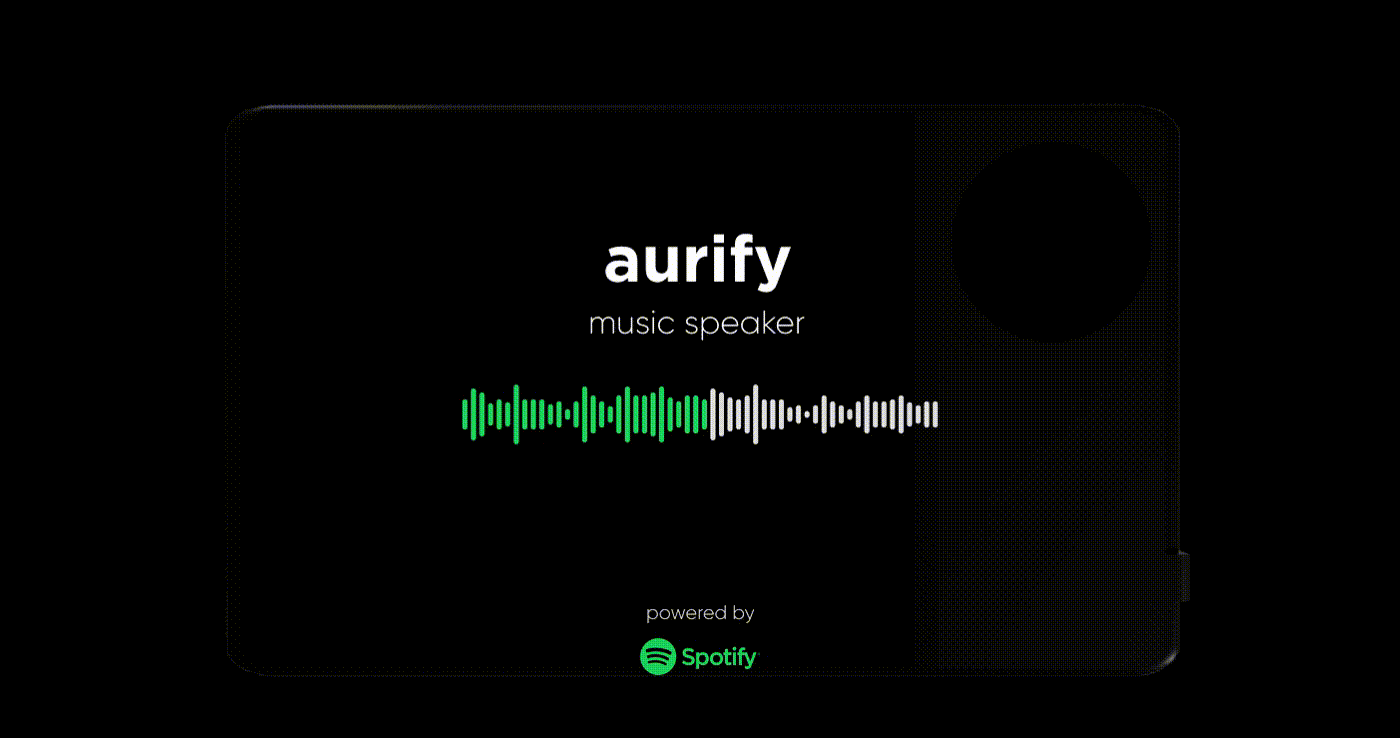
Final Product


The dial in this concept is the main analogous interaction where it serves as the Power button as well as can be used to regulate volume.
As per intuition, every human turns dials clockwise in order to go forward and this intuition has been built by various other objects in the environment ranging from screws to clocks on the wall; in order to increase or go forward, people turn dials in clockwise manner. Therefore, this form doesn’t have any markings on it.

Screen provides more than just displaying the information about the current track you’re playing. It also acts as a way for Spotify Canvas to set up the artist’s creative creations which can aid in the ambiance of the whole Spotify listening experience.

Aura Orb


Aura Orb is the energy you carry within yourself and symbol of who you are by your music taste. The Aura Orb is a form of data visualisation where we combine the already existing visualisation Aura from Spotify Wrapped 2021 along with gradient mesh deformation via using genre specific symbols. The Aura Orb combines listener’s vibes and favourite genre.
In Spotify Wrapped 2021, the Audio Aura was created from six broad mood categories (i.e. “Happy”, “Calm”, “Hopeful”) represented by colours that would then be narrowed down to two to create the audio aura.
It works by counting the number of streams for a given track, retrieve its top mood descriptor as determined by mood descriptor dataset. Calculate streams, moods are bucketed into six mood categories which are associated with colours and is later represented blurred gradient which is the Aura


How is Aura Orb formed?
Database has two specific datasets where one helps in deciding Aura gradient while other helps in deciding the symbol for the genre listened by the user. The Aura is formed where the specific colours are chosen. For Auro Orb we select the top three moods.


Each genre is specified by a symbol that acts as gradient mesh for the gradient formed above, this gives the impression of that symbol within the Aura itself.


By using the symbol path lines as gradient mesh, we’re finally able to form Aura Orbs.


Social Campaign
In order to create successful campaign for the launch of product. It’s ideal for Spotify to launch the product during the Spotify Wrapped season where multiple users will not only be eager and proud to share their data visualisations on their social media, but also let them share how their Orb would also look like on their own personal speaker.


Listeners can also scan the Aura ID on the back of speaker as well as share these on their Social Media platforms. The Aura ID lets people know about each other’s music taste and let spotify create a blend like playlist based on that. Aura ID is extension of yourself and also lets you connect with others as well.

Interaction & UI Panels
Realising how the product had it’s screen as it’s core of whole experience. Almost every other Interaction is controlled via screen itself. The Screens utilised the already existing Spotify’s UX Guidelines along with proper placement on this new form of screen.
Analog UX Flow
Before going to embark the UI screens, it's far more important for us to understand how analog controls work and how will our user even use it in first place,

The dial has two types of range of motion, the 'Rotation' and 'Drag' which works similar to directional pad found in controllers.
Rotation is useful for volume control, screen brightness, general scrolling, etc. It is viable for any function that acts like a progress bar in nature.
Meanwhile, the diagonal pad or D-pad controls are better in this case for general navigation where primary functions are similar to navigation buttons that one can find in phone. Also by intuition right refers to 'confirm' or 'proceed' action and left refers to 'back' or 'cancel action' which is also observed in android phones.
Sensory Feedback
Important functions which would be used especially under low-cognitive effort scenarios (whenever user isn't paying attention, indulged in activity that involves their sight away from product, etc.) requires appropriate sensory feedback to get deed done.
In the case of tactile feedback, i chose vibration feedback of 300 milliseconds for choosing/selecting an action and 600 milliseconds for confirming the action. Most of smartphone users are acquired to 400 millisecond vibration (true for both IOS and Android). Hence, the values of 300 and 600 milliseconds after being tested were found to be easily distinguishable, hence perfect for distinguishing between different actions.
Auditory feedback consists of very short burst of sounds that don't hamper listening experience. A simple mild pop sound is for choosing/selecting an action and a quick double beat version of same sound confirms it. While another notification alert for errors, low battery level,etc is also mentioned but has higher amplitude and lower pitch compared to the pop sound.
Wireframes and UI
Following Jakob's Law, users bring expectations from familiar products to similar ones. The wireframes prioritize a touch-screen experience similar to Spotify's mobile and desktop platforms. It's designed to be user-friendly for touch screens while also accommodating the use of an analog dial to spice up user experience.

As for the UI elements, adjustments were done to already existing Spotify's UI. Elements were re-designed a bit to be used for our product which has a screen size similar to that of a mini tablet.
The keyboard UI was adjusted as well to how user would handle and hold the speaker. By default the keyboard is set to 'floating' which is something users are familiar and will indicate an adjustable / customisable sign to our users thus further prompting them to experiment and explore keyboard settings more to find their suitable keyboard match. The design is largely based on 'gboard' with subtle changes that match the spotify's design guide and made in accordance to Aurify's use experience.


There are three versions: floating, stretched, and split. The floating one is mentioned earlier, the stretched version extends almost end to end, and the split version is adjusted with a 7:3 ratio and an additional column of ghost keys for assistance. You can configure the keyboard in settings. Typing and editing are crucial functions, especially when you need to enter names of playlists, songs, and artists.

The split being in 7:3 ratio was done since unlike the tablets, the user's right hand ( from their user's first person view ) would have a space of 5,53 cms between hence a 1:1 ratio slit would render split keyboard's use nugatory. The ghost keys are also found in some split keyboards which help users type regardless of one side having bit of disadvantage.

In the above figure, most of split keyboard features are in comfortable range of user's fingers. The ratio of 7:3 justifies itself keeping in mind Aurify's dimensions and physical ergonomics.
Information Architecture and Final Screens

You can smoothly navigate through the architecture, but there are special screens, like anchors (quick access via upwards on dial). These screens provide quick access to things like podcasts, your last playlist, or going straight back home. It's like having a home and app overview all in one, similar to Android's bottom navigation bar.

Turning the dial normally changes settings. Sliding it down activates a mode where turning selects options. If 'General Scrolling' is chosen, turning won't change settings but scrolls through the last selected item. This option is used best for the next type of screens and pages i,e. main pages, playlists, queues, etc.

Most of head pages (i.e main screen, podcast screen, etc) all have one UI element 'Carousel' in common and can be scrolled via simple finger drag or simply via rotating your dial on 'general scrolling' first.

Screens were also designed to be responsive as seen in example of fitting the slider of 'Now Playing View' which showcases more artist information, option to follow them, etc.

The 'Accordify' mode is a way for the speakers to develop music and entire continous playlist as per their user's music taste. This is different from blends which one can make via scanning 'Aura Orbs'. Accordify is special in party sessions or any get together events where all speakers can emit song in harmony and let music that defines entirety of group to play


Conclusion
From it's physical form to whole user experience, 'Aurify' aims to change what we perceive as portable speakers and leverage listening experience to next level. It uses same workforce at it's disposal as in 'Car Thing' and markets itself with minimum capital.
I would love to hear your feedback and thoughts, and if you're someone from Spotify... I'm open for new work roles since Spotify Premium doesn't come free :')
Thanks you for seeing my project :D
